Items
-
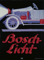 Bosch Automobile Headlights Lucian Bernhard created the Bosch Licht (lights) in 1913. Several further product posters came after the original one. In addition to its formal appearance, the poster has an oddly muted color scheme thanks to matte violet tones.
 -
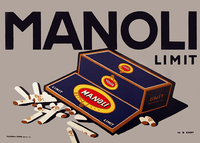 Manoli Advertisement poster for Manoli, a Berlin-based cigarette factory.
 -
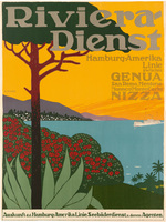 Riviera-Dienst Many published descriptions of this poster state different dates, however the paddle steamer Prinzessin Heinrich is featured, which only conducted the Riviera Service for the Hamburg America Line in the winters between 1904 and the start of World War One, allowing us to more precisely date this poster. The ship was scrapped in 1923.
 -
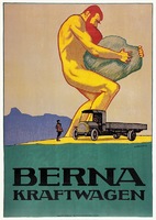 Berna Motor Car This allegorical advertisement clearly illustrates the load-carrying capacity of Berna trucks. The enormous figure seems to have been taken from the well-known poster advertising the inauguration of the Bernese Pass three years earlier. The tunnel, which connected Switzerland's north to Italy through Berne, was proof of the city's skill in heavy construction. It's impossible not to be captivated to the poster because of its simplicity and lovely soft Fauvist color harmonies.
 -
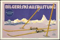 Bilger-Ski A skiing poster for Bilgeri Werk Bregenz depicted wooden skis and poles in the snow in front of the Alps, with the Matterhorn mountain peak dominating the horizon in Zermatt, Switzerland. The Austrian ski manufacturer Bilgeri used the image of these Swiss mountains as a symbol of the superior quality of their ski equipment.
 -
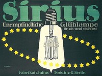 Sirius - Insensitive incandescent lamp Poster for the well-known brand of incandescent lamps in Berlin. The Plakat genre is highlighted by the bold and eye-catching font, plain objects, and dark background.
 -
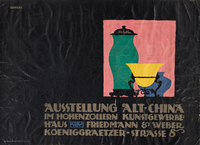 Exhibition Old - China Gipkens was an exceedingly active poster artist both before and after World War I. This architecturally composed and typographically flawless poster is one of the finest examples of the German poster school prior to World War I.
 -
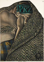 Poster for the Swiss clothing company PKZ In 1917, Baumberger started routinely working for PKZ. This poster is not only his best creation for the company but also a significant milestone in poster history. The tweed coat is depicted with such close-to-photographic realism that we can practically touch the material. Baumberger introduced a brand-new approach to advertising by cleverly incorporating the text from the advertisement into the image as a label on the coat.
 -
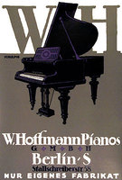 W. Hoffmann Pianos With its flat depiction of the object, bold typography, and monochromatic background, Bernhard's 1910 Steinway & Sons advertisement was an obvious example of Sachplakat. Without a doubt, Schulpig's skillfully crafted design is a "tribute" to Bernhard, capturing the spirit of the original poster while adding a little more piano detail and more text.
 -
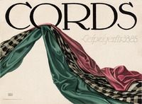 Cords Lucian Bernhard produced this piece of art for the Berlin fabric store Cords. In Cords, you can only see the cloth, rich in texture and color, along with the store's name.
 -
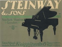 Steinway& Sons The 1910 Steinway & Sons poster by Bernhard was a clear example of Plakastil, with a flat portrayal of the product, bold text, and a monochrome backdrop.
 -
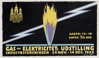 Gas and Electricity Exhibition Henriksen, a Dane who was educated in Copenhagen, helped to the development of poster art in his homeland during the 1920s. This dramatic poster for a gas and electricity show in Copenhagen requires little more than a lightning bolt and a flash of flame. The design was produced in the Plakatstyle, which established the appearance of precise and clean modernist advertising in Germany and Switzerland around the turn of the century.
 -
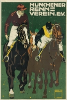 Munich Racing Club Jockeys on horseback.
 -
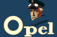 Opel Similarly to Lucian Bernhard, the Berlin-based artist Hans Rudi Erdt used a minimalist approach to design, emphasizing flat colors, basic forms, and powerful typefaces. In his designs, Erdt adopted a less literal approach than Bernhard, who concentrated on the goods being promoted. His advertisement for Opel autos, for instance, does not depict the automobile itself. The brand name is positioned in front of and beneath the image of a man who wears driving goggles and a hat. That's all.
 -
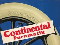 Continental Pneumatics Continental Tires was established in Germany in 1871. They were enormously successful not just in Germany, but also in France, where they constructed a huge plant and employed Leonetto Cappiello and Mich to make posters marketing their wares. They also engaged prominent artists in Germany. Gipkens was a self-taught poster artist who was quite busy both before and after World War I. He worked for the prominent business of Hollerbaum & Schmidt, whose stellar roster of painters included Lucian Bernhard, Hans Rudi Erdt, Julius Klinger, and Ernest Deutsch. Gipkens' Object Posters is a strong continuation of Bernhard's, exhibiting a section of a tire with a placard dangling from its air valve.
 -
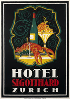 Hotel St. Gotthard Zurich This is the timeless design of a magnificent large hotel located on the trendy Bahnhofstrasse in Zurich. Designed by renowned poster designer Otto Baumberger in deep, rich hues, it remains an attractive emblem of exquisite hospitality.
 -
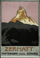 Zermatt The Zermatt Tourist office commissioned Emil Cardinaux to design this poster as an advertisement for the Zermatt ski resort. The text for the artwork consists of only four words in a casual sans serif typeface. This choice of typeface makes the item look inviting and complements the hand-drawn, casual tone of the piece. The orange hues of the word "Zermatt" connect the bottom of the poster to the peak of the Alps. This poster reflects the style of the German Plakatstil from before the First World War and foreshadows the Swiss Realism of the early 1920s with its boldness, simplicity, and strength.
 -
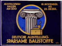 German Exhibition, Economical Building Materials In front of an Ionic column, a money box and coins are seen on the poster. An exhibition of economical building materials is announced in the text for Berlin.
 -
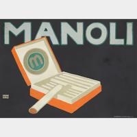 Manoli During the 1910s and '20s, Bernhard executed at least a dozen designs for Manoli, a Berlin-based cigarette factory founded in 1894 by Jakob Mandelbaum. This one is a quintessential example of Bernhard's characteristic Sachplakat aesthetic, in which the image is diluted down to its most vital essences: the brand name and the product sit against a deep black background. But rather than coming off as stark, the image is coyly enticing: a chic flip-top deck presents its pleasures while a single cigarette teeters off the edge, beckoning the nicotine lover to indulge. (Source: Excerpt from Rennert's Gallery: LIVE AUCTION, Live Bidding began Mar 14, 2021 at 11:00 AM EDT.)
 -
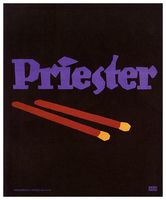 Priester Matches In 1906, Lucian Bernhard created Priester Match posters as part of a poster competition sponsored by the Priester Match Company. With limited time to create his work, he relied on innate design choices to encourage matches, focusing on symbols and shapes rather than elaborate pictures. Bernhard marketed the brand name Priester with a powerful, straight purple typeface. The key item, the matches, is emphasized on the poster design, and the shapes and objects are simplified with a flat black backdrop. In contrast to intricate and lengthy Art Nouveau posters, Bernhard's work is marked by bold typography, basic objects, and flat colors, as well as the poster's lack of a border. The method of communication in this poster is no longer symbolic, but rather a plain and direct statement about what the reader most wants to know about what you are presenting. What is the brand of this item? The lack of other distracting or undesirable factors quickly grabs the viewer's attention. This straight persuasive commercial drew a significant reaction and made Bernhard, a little-known young artist who developed Plakatstil, famous.