-
Title
-
Priester Matches
-
Description
-
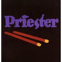
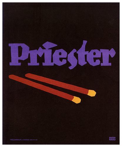
In 1906, Lucian Bernhard created Priester Match posters as part of a poster competition sponsored by the Priester Match Company. With limited time to create his work, he relied on innate design choices to encourage matches, focusing on symbols and shapes rather than elaborate pictures. Bernhard marketed the brand name Priester with a powerful, straight purple typeface. The key item, the matches, is emphasized on the poster design, and the shapes and objects are simplified with a flat black backdrop. In contrast to intricate and lengthy Art Nouveau posters, Bernhard's work is marked by bold typography, basic objects, and flat colors, as well as the poster's lack of a border. The method of communication in this poster is no longer symbolic, but rather a plain and direct statement about what the reader most wants to know about what you are presenting. What is the brand of this item? The lack of other distracting or undesirable factors quickly grabs the viewer's attention. This straight persuasive commercial drew a significant reaction and made Bernhard, a little-known young artist who developed Plakatstil, famous.
-
Date Created
-
1906
-
Format
-
59.5 cm x 48.5 cm
-
Identifier
-
12062001
-
Rights
-

 Priester Matches
